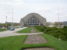
So if you haven't seen them, on loan from United States Botanical Gardens, are replicas of buildings on the National Mall in Washington, DC created by Paul Busse of Applied Imagination in Alexandria, KY. They also created the large Cincinnati scene music box used during the holiday show.


So after Krohn, I went to the Art Museum to see all their latest shows:
Gregory Crewdson: Beneath the Roses
Building Books: The Art of David Macaulay
Long Time No See: Hidden Treasures from the Cincinnati Art Museum

I'm a fan of David Macaulay's books so that was interesting to me. The size of the exhibit was much smaller than expected but I guess that was OK. Show continues only until September 7. The Gregory Crewdson was interesting. I'd be interested to see what others think.
I was a little disappointed in the Long Time No See. The art was OK and I liked some of the pieces but I was not a fan of how it was displayed. It was shown on walls made of just wood 2x4's and I just thought it didn't let your eye focus on the art. Maybe it was just me. Maybe I'm used to art being displayed on clean, crisp walls. I understand why they did it I think but just wasn't a fan.

While there I also checked out the Third Floor Contemporary Art gallery where I had never been before. It is up just under the roof of the Great Hall. Fantastic space. Note: The Museum needs better Contemporary Art in my rather uneducated opinion.

While there I was also able to check out the Warhol "Pete Rose" and the model of the proposed expansion to the Cincinnati Art Museum by Neutelings Riedijk Architects. Sara Pearce has some greats posts (and pictures!) about the expansion and the design on her Enquirer Art blog here, here, and here. In concept I think I like it but there is a lot to be worked out including parking and what exactly will go in that tower. But I actually like the concept of the tower. To me it sort of serves as a modern link to Hannaford's Eden Park water tower, where one used to be able to go up and get a view of the park and the city. I agree though that it really needs to be tied in to the main museum for it to be relevant.

.jpg)

3 comments:
It was shown on walls made of just wood 2x4's and I just thought it didn't let your eye focus on the art.
I think the rationale behind that exhibit it to make the case for why more exhibit space is needed -- because all these artifacts have been hiding in storage. So, perhaps the walls were an exhibit design decision in order to conceptually tie in with the need for more space.
I get why they did it I think; it just didn't make the art look good . . . in my opinion. :)
Hi Dan,
Glad to hear you enjoyed your trip to the Art Museum! If you'd like to see more works by David Macaulay, the exhibition is co-presented by the Fitton Center for Creative Arts in Hamilton and their portion features works from Ship .
We look forward to seeing you again soon!
Elizabeth
Visitor Research Coordinator
Cincinnati Art Museum
Post a Comment