Top 6 answers on the board . . .
1. Chiquita Brands International Building (1985)
Northwest corner 5th & Sycamore Streets
Northwest corner 5th & Sycamore Streets
2. Center at 600 Vine (1984)
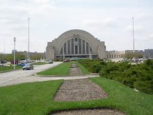
3. Millennium Hotel (1968 & 1977)
Northeast corner 5th & Elm Streets
Northeast corner 5th & Elm Streets
4. Federal Reserve Bank (1972)
Northwest corner 4th and Main Streets
Northwest corner 4th and Main Streets
5. Monroe Tire (1968)
Southwest corner Central Parkway & Walnut Street.jpg)
Southwest corner Central Parkway & Walnut Street
6. 630 Main Street (1960)
Honorable mentions would include the Court Street Center (Renovated 1985), Cincinnati Bell Addition (1975) and maybe the Cincinnati & Hamilton County Library (1955, Additions 1982 & 1997).
I thought "worst" was too harsh. And "ugly" not accurate. But these buildings are those that I just do not think are good urban buildings. By that I mean they generally are not built to the street right of way and the public sidewalks, do not offer much to the public right of way, or are more typically "suburban" in their development or site planning. I did not include any parking garages as I covered those in an older post although a couple of them might be the worst of the worst. I also tried not to focus on the actual architecture as it is mostly subjective. I looked at form, scale, orientation, access, etc. and tried to not look at the aesthetic qualities. Although I will admit, the architecture is a factor on some of them.
I thought "worst" was too harsh. And "ugly" not accurate. But these buildings are those that I just do not think are good urban buildings. By that I mean they generally are not built to the street right of way and the public sidewalks, do not offer much to the public right of way, or are more typically "suburban" in their development or site planning. I did not include any parking garages as I covered those in an older post although a couple of them might be the worst of the worst. I also tried not to focus on the actual architecture as it is mostly subjective. I looked at form, scale, orientation, access, etc. and tried to not look at the aesthetic qualities. Although I will admit, the architecture is a factor on some of them.
Many of the buildings on the list were a result of the Block Plan of 1964 (Chiquita, Millennium, Federal Reserve Bank) and from about the same time period (Center at 600 Vine). They are large buildings with setbacks and/or plazas that, while common of the time period, in my opinion are not successful at street level. I hate plazas or setbacks with no real purpose or that do not compliment the public realm. A set back at a church or large public building is understandable. (Though, I still wonder if the Aronoff Center or even P&G should be listed in the unsuccessful category.) But I just don’t think a bunch of paving with some modern sculpture or fountain always makes for great public space. It is just wasted space. Oh, and Millennium is just bland and ugly.
The Federal Reserve Bank fails in my opinion by its treatment and orientation away from 5th Street. One may not like the architectural style, however it is at least consistent and the 4th Street façade and loggia do engage the street. However it gives nothing to 5th Street and Government Square except a restricted use park. Government Square would be a much improved as a public place if it was enclosed more by a building on its south edge. It simply erodes to the south now and is honestly in my opinion only vaguely recognizable as a "Square" anymore.
Monroe Tire is a development model of the suburbs yet in the Central Business District: a building (one-story to boot in this case) at the back of a lot and parking in front. (See Court Street Center too.) It serves the customer but doesn’t serve the city particularly well. I think this site is particularly interesting as it will be on the streetcar line and I’d love to see a more intense land use at some point. However, Artworks is putting a mural on the north side of the neighboring building (ACT). No offense, but I actually hope it gets covered by a new building some day. Note: The Goodyear Station at 317 E. 9th is similar yet is much older (1932) and does abut the sidewalk along Cheapside and part of 9th Street which is why Monroe is listed and not Goodyear.
630 Main Street has a singular design aesthetic but for the life of me I cannot understand why it is set back from all other buildings on the east side of the street. It just bugs me. It is such a great block too, save for that.
You will notice very few older buildings on the list. While some like 118 East 9th Street (1875) and 616 Race Street (ca. 1865 and later) need a little cosmetic help their form, orientation and scale are usually adequate and respectful. The "bones" are good; they just need a little façade improvement..jpg)
.jpg)
So you may ask why the Library shows up as a dishonorable mention. Well, while I get the "building in a park" concept, I just feel the addition north of 9th street has too much wasted space around it and dilutes the whole assembly. It replicates the gardens at 9th and Vine Streets and adds another surface parking lot at 9th and Walnut Streets.
Anyway, just my opinion.
.jpg)

4 comments:
Loved this post! I lol'd at the Monroe Tire building. I always thought it looked comically ignorant of of its surroundings.
I've always thought 118 E. 9th St. was an interesting building. It's a shame it's not in better shape.
And I agree with you about the library. It is somewhat fortress-like from the outside. I guess this may stem from the need to have fewer entrances/exits as each one has to manned by library staff.
I kind of like Chiquita, and I always liked that little building on 9th, its not ugly exactly, just needs some tlc and strikes me as fighting the David vs. Goliath fight, hope it stays. I mostly agreed with your other assessments. 616 race I walk past many times a day, man its screaming for something. its a shame next to the Lyric Piano building that it ends up looking even more bland.
I like the original library, and the addition is good for users on the inside, but it is a complete street killer on the Walnut Street side.
The whole area around the Chiquita, Federal Reserve Bank, Western Southern etc is terrible for pedestrians. We walk through that area all the time on the weekends to get to the riverfront, and we go as fast as we can.
Good post, but too much to comment on, other that to say I generally agree...
Oh, give me a break! You don't think that the cupola atop Monroe Tire is one of our City's great landmarks?
LOL.
Post a Comment